


So you’ve got your show registered with Edinburgh Fringe, and you’ve got a contract with a venue. What’s next? It’s time to start shifting some tickets!
 The first thing you’ll need to sort out is your brand. Why the EFF would anyone come to a show if it doesn’t look or sound appealing? It’s not like there are around 4,000 other shows going on at exactly the same time in exactly the same place…
It is hard. Let’s not beat around the bush. When we were researching and writing this blog we genuinely tried to remember any – literally any – bit of branding/artwork/imagery that caught our eye at last year’s Fringe. We couldn’t, and we are a team of artworkers and marketers who spent the whole month and then some in Edinburgh last July/August.
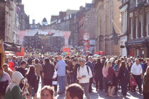
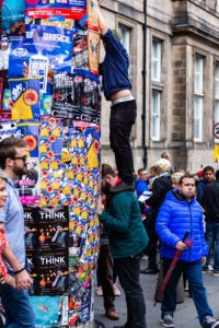
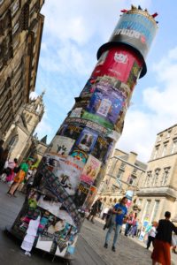
This is because there are around 4,000 shows going on at exactly the same time in exactly the same place (sound familiar?), and so show promo just becomes a blur to the punter who is faced with endless barricades of posters, lamppost wraps and flyers. Barricades… yet they’re meant to draw you in!
 So what’s the point? Well. You need to create something which starts a conversation – without a strong brand and visuals the show is unlikely to get anywhere, but with them you pave the way to getting somewhere. Thinking on the optimistic flipside, there may be almost 4,000 shows in 2019, but last year there were almost 3 million tickets sold…
With this mind-numbing dilemma on our hands, I had a chat with the artwork and design team from Interactive Theatre International, a production company with 12 years of Edinburgh Fringe experience (and much more besides). Together we came up with some Fringe-flavoured food for thought on visual branding…
The EFFing basics
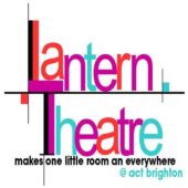
Simply put, you have to stand out. Your show has to shout louder than the thousands of others. Get inventive and think outside the box! Different will always stand out (although it is important to look at what other similar productions are doing/have done in the past; more on that later).
 To do this, you’ll need to create a strong and striking visual identity – strong images and strong colours. Make it pop. Think to yourself: ‘if I really walked past this would I bother looking in to it more?’. This can be really, really hard when producing your own show – what you think is perfect as an artist may not be appealing at all to a punter. So it’s always worth running artwork, and any promotional materials for that matter, by friends and/or family who are detached from the show to get their honest opinions.
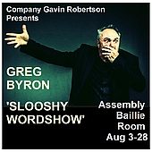
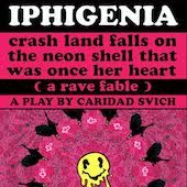
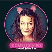
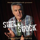
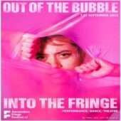
Having said that, your marketing materials should reflect the show itself. If it’s character-driven, then the images need to tell the show’s story, i.e. they need to have the characters in costume with relevant facial expressions, posture, gaze etc. If it’s a comedy, then the artwork needs to be fun and witty in its own right. How many times have you looked at a show listing and gone, ‘that looks alright’, and consequently considered going purely based on that initial reaction? It’s an incredibly high percentage when you get to Fringe festivals!
You don’t have to be an EFFing genius to notice rubbish branding
We all know what appeals to us. If you’re reading this you’ve probably encountered theatre marketing recently in some form or another. Hey, there’s almost certainly some on this page right now. Does it work for you? Why/why not? Apply that same thought process to your own artwork and brand.
 If there is something fundamentally wrong with a show’s artwork, it will stand out. Just looking at it will make you feel subtly uneasy. While a graphic designer may be quick at noticing and fixing these issues, anyone can with a bit of playing around. Is your text slightly misaligned? Are there discrepancies in font? Is it uneven and cramped? If you feel something isn’t quite right with a poster, the chances are you’re right.
Make artwork neat and organised. Text should flow easily. It has to be readable. Images should be high-quality (slightly geeky: 300dpi for print. Anything lower doesn’t scale well and will go fuzzy. Simple).
Know your EFFing materials and know your EFFing medium
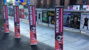 Flyers, posters, lamppost wraps, billboards. They are quite obviously different. Steer well clear of too much text on a poster, but do fill the back of a flyer with further details. Catch the audience with banners or posters and direct them online to find out more information – nobody is going to stand staring at the fine print detailing your artistic journey on a billboard. They may, however, follow an easily remember-able URL and check it out online – and hey presto, there will be a place to book tickets there too!
This is where you need to take budget into account – billboards and poster spots in Edinburgh during August are not cheap. It’s also worth noting that printing posters and taking them to Fringe with you on the off-chance that you can stick them up somewhere is pretty much useless (we found that out the hard way many many moons ago). Restaurants and cafes rarely want to display them, and all places around Edinburgh which could host a poster board already do. You’re better putting your resources and time elsewhere.
 Low budget? Streamline the process – there’s no point designing and printing expensive posters, so stick with flyers (and free digital platforms – more on that in weeks to come). Perhaps find another production to partner with? Consider double-sided flyers with a show on each side and halve your costs immediately. Exit-flyer similar shows instead of trying to put up a poster nearby. Fundamentally, get to know Edinburgh. Hone your flyering spots to maximise outcome (you get the point, and we’ll provide a practical guide to Fringe flyering when you’ve actually got your materials printed out anyway).
MILDY OFF-TOPIC PRO TIP: know your print shops! For quick turnarounds and cheap print runs, it literally pays to know where to go in Edinburgh. Yes, Ryman is practical and incredibly useful, but do consider bulk orders and local competitors. Plan how much you’ll need and it will save you a lot! We’ll help you out with some insider knowledge (genuinely not a paid plug): Edinburgh Banners. This is who we’re using this year for pre-orders, and they match Solopress prices. The Edinburgh Copy Shop. Fantastic for on-the-ground print runs, and saved our skin many times last year.
But how the EFF do I actually come up with some new branding?
 Chat with everyone involved in creating the show – artistic director, producers, actors, devisers – about the production’s personality. What colour would represent it best? What style of image reflects the characters? Build a picture of the show in still images, and then pick out the best and layer with fonts, colour etc (always remembering the EFFing basics, though).
Brainstorm with diagrams, mood boards, whatever floats your boat. Communicate the characters. Always refer to the basics: colour, font and image should suit the content. For character-driven productions, photographs capture the essence of the show, and lighting really makes photographs pop – this is an area where it pays dividends to invest in a good photographer. All you need then is one strong image, a relevant colour scheme and font. Lay it out and ta-dah!
I’ve got a great photo. How the EFF do I turn this into a poster?
So, about laying it out and the practicalities… here are a few things to think about when you actually have to get some images branded, and the process of turning a picture in to an A3 poster/flyer/hat/coffee cup or whatever (we’ve then done a handy step-by-step guide at the bottom of this post which you can refer back to easily).
- Details
- Logo
- Main image
 What details do you need to include? Website, venue, dates etc. It’s worth laying them roughly in place first, so that it doesn’t look like a crammed afterthought. What’s the logo? What size is it going to be? This depends on knowing your EFFing materials and medium – small on a flyer perhaps, but big on a lamppost wrap. Then slot in your money shot.
What program could you use to construct this? Canva is really easy to use, with no experience whatsoever. If you’re not a designer, have no money, and no friends who are designers then this is a winner!
With a bit more experience head to Photoshop or InDesign. It’s actually possible to get Adobe Creative Cloud monthly now, providing access to these programs for the time you need them, rather than purchasing the whole shebang. On that note: it’s worth continuing a subscription throughout August as artwork will need to be constantly updated with reviews, sold-out dates, new additions etc.
Any EFFing fool’s guide to branding and artwork…
1. Research: Look at other similar shows to you. What are they doing? What colours/messaging/imagery do they use? If your genre has a certain style – you can take elements from this as audiences will see it and know that it’s similar to other shows they like and might be more likely to take a risk and buy a ticket.
2. Get your money shot: For your main image – plan it, spend some time on it. It’s so important to get it right. We use professional photographers with studios and expensive equipment, but if you just don’t have the budget for a professional shoot, use a phone (any phone!) that has a good camera. Take some images with good lighting, colourful backgrounds. Experiment. Edit using free editing software.
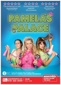
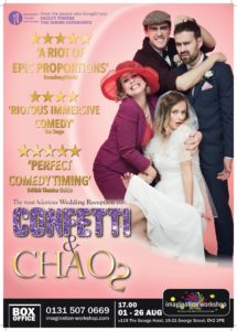
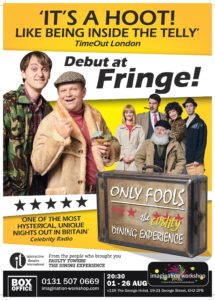
3. Follow the rules: There are also certain ‘style’ rules for Fringe show posters – reading down: quotes and stars should be at or near the top, then your main image with logo, then a strap line (which sums up what the show is about to the audience in one sentence), and then a strip at the bottom with all the boring/important ‘info’ – including the call to action to buy tickets, in one place. This needs price, dates, location, ticket link.
4. Verify your show: Add reviews, awards, sell-out show crests, stick stars and reviews on top of your posters as they come in.
5. Give an option to find out more: Include website or social links so people can find out other info, see videos and so on if they’re interested but not ready to buy a ticket just yet…
6. Proof: Get someone to proof everything you put out for spelling mistakes – your artwork, posters, flyers, everything. An error is bad enough; a wrong website link to buy tickets is a big no no!
Now go and get creative* – and good luck!
 This blog entry is indebted to the fountain of creative knowledge that is the Interactive Theatre International artwork and design team: Jamie Bowen, Alex McCombie and Siobhan Pollard. Selected images courtesy of edfringe.com.
*(if you haven’t already – and if that’s the case, you’d better get an EFFing move on!)