


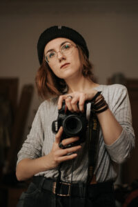
Theatre and performance photographer Mihaela Bodlovic knows all about creating compelling images that make audiences want to go and see shows. She will be leading an online worksop during Army@TheVirtualFringe to help companies ensure their media, marketing and promotional pictures stand out at future Fringe festivals. Read three top tips below.
Your promotional image is one of the most important parts of your Edinburgh Fringe show and deserves as much attention as your staging. I know it sounds like a ploy to get you to hire photographers, because, hey, we do love having a job, but hear me out.
The number of shows on offer can be overwhelming and festival time in Edinburgh sees every available surface covered in vibrant, colourful imagery. In this environment, it can be a struggle to connect with your potential audiences, so it’s important to make your visual communication clear and concise.
This is especially true if you’re not working with a massive budget and need to get those initial crowds in through the door.
Your show could be a Fringe First winner in the making, but a potential audience member doesn’t and cannot know that in advance, so your very first job is to engage people’s attention.
While I’d always highlight the importance of actually talking to your potential audiences instead of just pushing a flyer at them, more often than not your image will have to speak for itself, without you there.
Ultimately, your image is an extension of your show.
It represents your show all the way until the moment your audience walks into the theatre, as well as attracting potential reviewers.
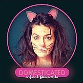
Photos promoting Edinburgh shows tend to be taken so far in advance it’s not always easy to know what you want, but really sit down and think about what imagery represents not just the topic but also the feel of your show.
Is it serious? Playful? What will your audience think when they see the image?
With this in mind, here are three tips for a stronger promotional image.
1) Less is more
Too many elements featured in an image make it more difficult to “read”. Aim for an image that represents a strong symbol for your show and work with an image layout that highlights it.
2) Break the pattern
There are so many images shouting information at people. Try to get an image that creates a visual disruption in the noise – is it more minimalist than expected? A block colour? Something a bit unusual? Think how you can break the norm.
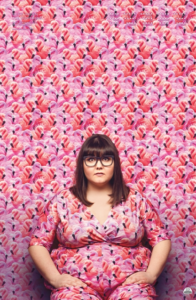
I always like to think about what would make me, personally, stop in my tracks and pay attention to an image. A great example is this poster image for Sofie Hagen’s The Bumswing, photographed by Matt Crockett (see above) and designed by Haiminh Le. So much colour! Barely any text! It really made me stop and examine it in detail when I first walked past it in the Meadows.
3) Create an image people want to take home with them
Photography and design are art forms so why not treat your image as art? Create a striking piece of art that inspires your audience to look at it simply because they like the picture, not as a piece of advertising.
This is far from an extensive list, but hopefully it’ll open up discussions on how to approach your marketing in the future, and give your show the best shot at success once we’re all back in theatres!
- Mihaela’s workshop takes place at 10am on 12 August is free but places need to be booked in advance – see https://www.armyatthefringe.org.